Redesigning the touchscreen interface of a pharmacy dispensing robot used across Europe, shifting from an engineer-built UI to a touch-first.
THE QUICK SNAPSHOT, IF YOU ONLY HAVE A MINUTE
Redesigning the touchscreen interface of a pharmacy dispensing robot used across Europe, shifting from an engineer-built UI to a touch-first.
Context
BD Rowa builds dispensing robots used in thousands of pharmacies across Europe. The touchscreen UI had been built by engineers, without a designer ever in the room.
Problem
Pharmacists found the system slower than dispensing manually. Onboarding burned through support calls. The interface broke down across languages and experience levels. And when something went wrong, staff had no idea how to fix it.
My Contribution
I co-led the redesign, owning the design system and core interaction model. My co-lead owned research synthesis. We partnered on fieldwork across Germany, Austria, and France.
Outcome
The Redesign V1 shipped in 2026.
- Support calls dropped,
- The BD Rowa design system is now the standard for all future features, and
- Customer feedback on speed and clarity improved measurably.
CONTEXT
The Rowa is a robot that sits behind the pharmacy counter, storing thousands of medication packs and delivering the right one to the pharmacist in seconds while a customer waits.

The users are pharmacy owners and pharmacy managers. They operate under time pressure, with walk-in customers waiting at the counter, often managing multiple machines alongside a broader pharmacy inventory system (the Warenwirtschaftsystem, or WWS).
Speed and trust are non-negotiable. A single delay at the counter changes the customer experience of the whole pharmacy.
CHALLENGE
The original platform was developed and shipped without a designer involved. It worked, but four things were breaking at once.
The original platform had been developed and shipped without a designer involved. It worked, but it did not fit the job it was doing.
Four things were breaking at once.
Speed
Dispensing a medication through the UI was taking longer than doing it manually. Pharmacists were complaining about this directly. For a tool whose entire promise is speed, this is existential.
Onboarding
BD Rowa ships around 1,000 new installations per year. Each one came with a long tail of support calls from staff learning the interface. Customer support was becoming the product's bottleneck.
Language fragility
The platform runs across Europe. We observed that much of the pharmacy staff operating the machines were not native speakers of the language of the country they work in. Text-heavy interfaces forced them to rely on translations that often misled them.
When something broke, staff were stranded
The machine gave no meaningful diagnostics. When something went wrong, staff had no way to understand what had happened or what to do about it. Every incident became a service call. This was expensive for BD Rowa, disruptive for the pharmacy, and left staff feeling helpless in front of a machine they were supposed to be operating.
RESEARCH
To understand why the platform was failing, we travelled to pharmacies in Germany, Austria, and France and watched the system being used in the wild.
My Colleagues led the research synthesis. I participated in fieldwork in Germany and contributed on how the findings translated into the system.
What we did:

Observation
Contextual observation of pharmacists during live customer service
Interviews
Interviews with pharmacy owners and managers about goals, frustrations, and workarounds
Audit
Heuristic audit of the existing platform
One quote from a pharmacy manager in Germany captured something that shaped the whole project:
Deutsche 🇩🇪
"Wenn ich am Rowa bin habe ich direkt eine ganz andere Verbindung zu meinem Lager, als wenn ich vor dem WWS stehe."
English 🇬🇧
"When I'm at the Rowa I have a completely different connection to my inventory than when I'm standing in front of the WWS."
The physical machine gives users a grounded, sensory relationship with their stock that a desktop view strips away. The redesign had to preserve that feeling on the touchscreen, not flatten it into a generic admin UI.
Example of the previous screens...
DESIGN DECISIONS
Out of the research, four insights did the most work in shaping every design decision that followed.
The Rowa is a short-term tool, not a planning system
Pharmacists use it to answer "what do I need right now?", not "what should I buy next quarter?" That lives in the WWS. Scoping the UI to short-term decisions made everything simpler.
Non-native staff make text a liability
Language was not just an internationalisation problem. Much of the workforce was operating in a second or third language.
The more text we put on screen, the more reliant users became on translation quality we could not control.
Users physically enter the machine, and they are afraid of it
During maintenance, staff enter the Rowa and fear being locked in or leaving tools behind. The UI had to actively protect them, the machine, and the stock.

Trust is a gradient, not a switch
Pharmacies kept high-value or fragile meds outside the Rowa. They didn’t trust it with critical stock. Trust isn’t designed in one release. It’s earned through visible reliability, so we focused on making that reliability clear, feature by feature.
From these insights, we defined four principles that held every design decision together.
1. Seamless integration
The Rowa should feel like an extension of the pharmacist's workflow, not a second system to learn.
2. Reliability
Every action should give clear, immediate feedback. The user should never wonder whether the machine heard them.
3. Transparency
The live state of the machine should be visible at all times, so users can trust what they see.
4. Peace of mind
When things go wrong, the interface should reassure and guide, not alarm.
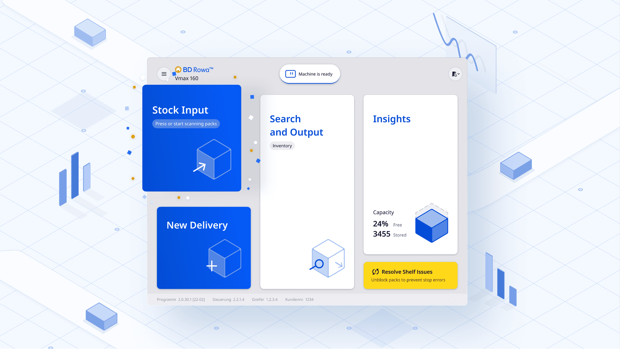
CORE DESIGNED FEATURES
The original UI required reading to navigate, which was costing pharmacists seconds they didn't have while serving customers at the counter.
Insight
We replaced text labels with recognisable iconography, condensed multi-step flows into single screens where possible, and used large touch targets so pharmacists could operate the machine without pausing to look.
What we considered and rejected
A configurable dashboard where each pharmacy could set their own layout. It tested well with owners but poorly with managers, who were the people actually using it daily. We kept the interface opinionated.
Because we observed non-native speakers operating the UI across three countries, we treated every piece of text as a liability rather than a feature.
What we did:
- Replaced text with icons for key actions
- Standardised status signals for clarity across languages
- Kept text only where precision mattered.
Outcome
This made the same interface work for a native German pharmacist in Munich, a Portuguese-speaking pharmacy assistant in Vienna, and a French-trained manager in Lille, without three different UX paths.
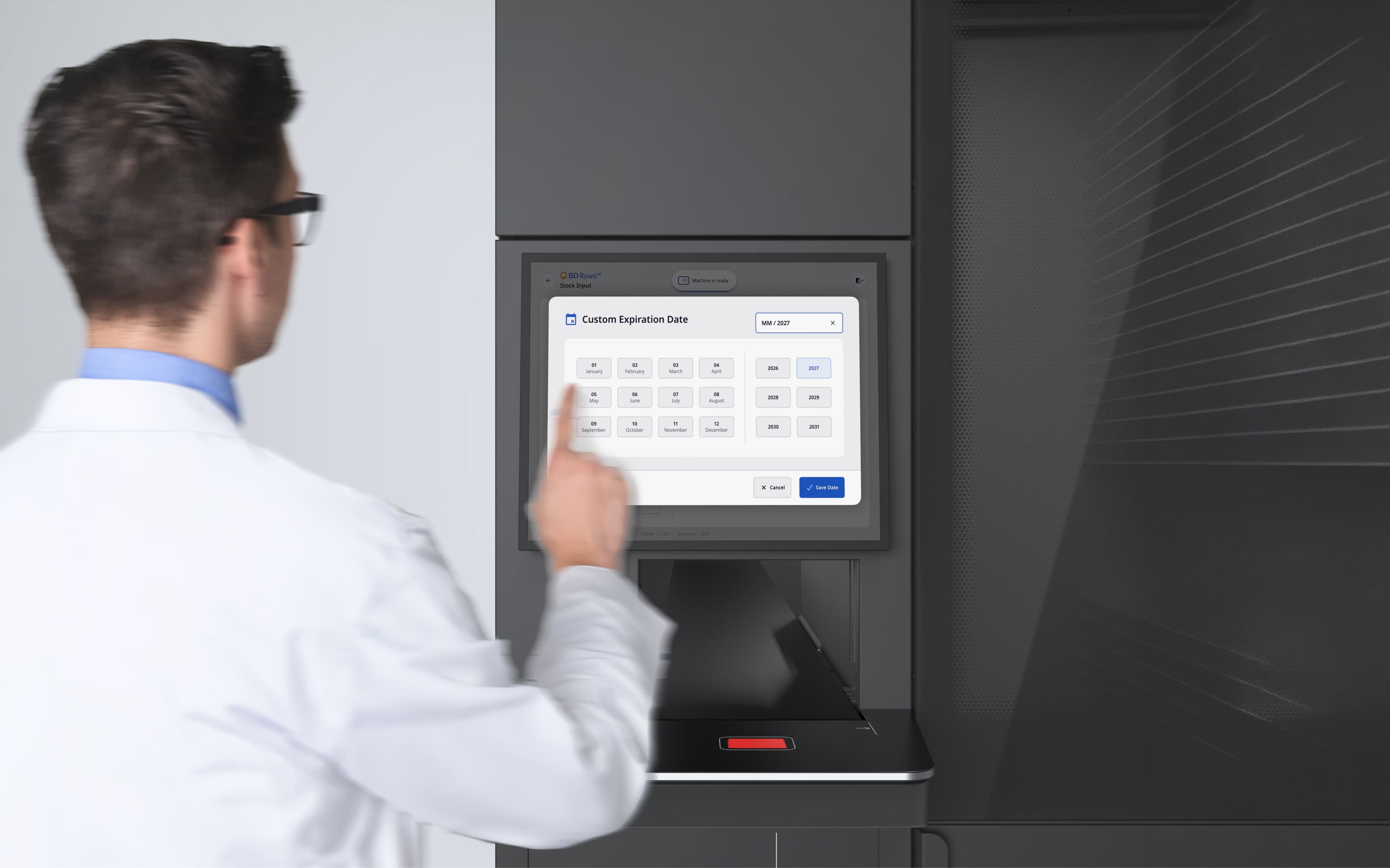
When something went wrong with the original platform, staff had no path forward. The machine didn't tell them what had happened, where, or what to do, so they called BD Rowa every time.
We designed the self-diagnosis flow around a single idea: meet the staff where the problem is, and walk them through the fix.
How it works:
- The system pinpoints the issue, shows exactly where it is
- The UI surfaces the problem with a visual of where it is, no cryptic error
- Walks staff through the solution step by step, with simple, actionable instructions.
What we considered and rejected
A text-based troubleshooting log. It tested badly, because the same language fragility that plagued the main UI applied to error messages. A translated error that almost makes sense is worse than no message at all. We committed to visuals-first diagnostics.
During fieldwork, we kept hearing the same word from pharmacy staff: Scared. Not frustrated. Not confused. Scared.
They were scared of three different things, and the system needed to address all of them.
- Fear of being locked inside the machine,
- Fear of damaging the machine,
- Fear of damaging the stock.
All three fears came from the same root: the machine wasn't transparent about its own state, and it wasn't proactive about protecting what the user cared about.
What we designed:
- Explicit lockout and confirmation flows for physical access.
- Proactive checks before the machine moves.
- Transparent handling of sensitive stock.
The harder truth
We knew from the research that no design would convince pharmacies overnight to put their expensive stock inside the Rowa. That trust has to be earned across months of reliable operation..
CONSTRAINT
The engineering platform was already built, which meant we couldn't redesign the backend, the data model, or the machine's control system. Our job was to find the design space that was still achievable and make it excellent.
In practice this meant:
- Worked closely with engineering to understand constraints,
- Built a backward-compatible component library.
- Prioritised high-impact, low-effort changes.
This constraint shaped the design system I built. Every component had to work within the realities of a platform that could not be rebuilt, only re-dressed.
IN RETROSPECT
Looking back, this project taught me that designing for hardware-bound software is a different discipline, and the lessons go beyond the screens we shipped.
The core insight
The biggest design decisions were about less, not more. Removing text, removing steps, removing configurability. When the product had to work for a tired pharmacist, a non-native-speaker assistant, and a new hire all on the same shift, restraint was the design.
On trust as a gradient.
The hardest thing I learned on this project was that you cannot ship trust. Pharmacies kept their most expensive stock outside the machine not because the Rowa was unreliable, but because they had not yet seen it be reliable with stakes that high.
No visual polish or reassuring copy shortcuts that. What a designer can do is make each small act of reliability legible, so that trust has something to build on. V1 is the first deposit in a long account.
What I would do differently
We scoped the redesign tightly around what engineering could support. That was the right call for shipping V1, but I now think we should have documented the changes we would have made with an unconstrained platform.
That backlog would have given BD Rowa's product team a clearer roadmap for architectural investment beyond V1.
What this project taught me
Designing for hardware-bound software is a different discipline from designing for the web. The UI has to respect the physical state of the machine, the physical space around it, the physical safety of the person using it, and the emotional weight of the stock inside it.
ROn systems embedded in someone's daily workflow, helping users resolve their own issues is not a feature, it is the basic deal the product has to uphold to earn its place.